Wednesday, March 30, 2011

Sunday, November 28, 2010

Sunday, November 21, 2010

Sunday, November 14, 2010

Sunday, November 7, 2010

Sunday, September 26, 2010

Sunday, September 19, 2010

Sunday, September 12, 2010

Tuesday, May 11, 2010

Tuesday, May 4, 2010

Keep flying


If hell boy had a hamster, he would totally look like this. He likes cats too much so I don't think we have to worry about that, but just in case.

I did the GorrillaZ style in flash because the line quality seamed smooth but comic like at the same time. I started out in photoshop but it wasn't smooth enough, even with a wacom. I really like that flash has that ability to make your line smooth, But anyway.


I thought the GorrillaZ and Hellboy had a very similar Line quality. Hell boy has a thick shadow but GorrillaZ didn't seam to have hardly any shadow. They used thick lines to indicate wrinkles in clothes.Hell boy has a small indication of gradient for the background, while GorillaZ use a small amount of texture when needed


Tuesday, April 27, 2010

Adventure Time!!

So,I wasn't very happy with the backgrounds with the last test. The colors were pretty odd and a little distracting to the characters. I used darker colors and lower saturation for these new ones. I think they look better this way


And just because I know your just dying to see the animatic to this animation....Its right here
*This animatic was turned in for a different class, I just wanted to put it up here too, so plz dont hurt meh >.<*
The aimatic goes by pretty fast and its only the first 6 scenes. I'm still working on the timing and stuff for my animatic. It should be done soon ~*W00T*~

Tuesday, April 20, 2010

Tuesday, April 13, 2010

Style test

<-----Invader zim


Invader zim style


Disney style


anime style


Sorry I fell behind a little. I'm going to finish this today and add more to this post. I was also too picky on the styles I wanted to use because they werent different enough. I chose these three because they are really different from each other. The invader zim style is more organic and dark. Disney style is a more happy and smooth style. I enjoy anime so I though it would be kinda funny to see my character in an anime form. Anime has alot of different styles to them so I took the really cute look. That style doesnt suit mike very well but I really like the invader zim style.


Tuesday, April 6, 2010

Back ground test


I wrote down 3 questions and asked people out side of my classes.
1. Does the story make since?
2. What could change About the story plot?
3. additional comments?
The story made since for the most part. Everyone liked my character design but thought the girls color design was a little odd (my thoughts too)
They said the animation could have more jokes, wasn't too clear what kind but the ones I have now are ok.
for additional comments, the hamster is really cute and the animatic needs to be timed out more.
Schedule
Week1-rough animation for mike
Week2-Clean up rough for mike
Week3- rough animation for melissa
week 4-Clean up rough for melissa
Week5-background


Monday, April 5, 2010

Re-Post 1


The Dream sequence in "The princess and the frog" was very stunning. All the figures were in a vector form and it had no out lines. I was actually considering doing a style similar to this in the flash back scene when Hamper gets sad.
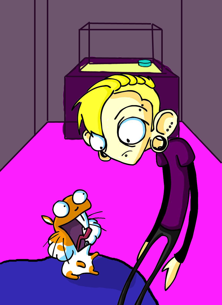


With this image, I wanted a watercolor look. I'm going to use real watercolors tomorrow and see if it turns out better. I like It though, Using a dark out line seams a bit intense. This is softer to the eyes.

I'm rather fond of cartoon networks recent cartoon called "chowder" They use textures for their palette with solid colors. with my character I used a two different textures with some soft colors.

Tuesday, March 30, 2010

RAWR!


So I worked on the color of my characters and I've decided between these two


I was pretty happy with Mike's design and the colors he had so I didn't make a whole lot of changes. with melissa, I might have done a little too much. Blue hair with a green shirt...not very appealing to your eyes. When it comes to hamper, he was a little difficult because I wanted a bold color for a hamster for his bold personality. The blue is nice but I might stick with the orange.

here is a model of hamper I am working on. I need to get more sculpty clay though. hes a little to small (even for a hamster)


SKETCHES AND STUFF